
Chapter 1: Typography in Web Design – Contrast, Font Size & Hierarchy
September 6th, 2011
Typography derives from the Greek words ‘typos’ and ‘graphe’, meaning ‘form’ and ‘writing’. In web design it is the technique and art of arranging typefaces, which manifested when Tim Berners-Lee launched the first website in 1991. http://www.telegraph.co.uk/news/newstopics/ nationaltreasures/2194133/Sir-Tim-Berners-Lee-portrait.html Contrast The contrast between typography and background requires consideration of colour and font types. The purpose of text is to be perused […]
Article written by
Soccerscout USA
July 25th, 2011
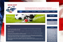
Digital Mosaic launched the Soccerscout USA website to further the careers of nationwide footballers in the States. We tried out for the team but took the dribbling too far, when we spotted the manager eating biscuits from the sidelines. ;o)
Article written by

ETS Website
July 22nd, 2011
Digital Mosaic present their re-vamped website for ETS-Electromagnetic Testing Services company. Luckily our director’s cybernetic leg slipped under their radar. ;o)
Article written by

The London Daily News
July 21st, 2011
Digital Mosaic have recently re-designed the website for The London Daily News, keeping readers informed with the latest headlines. Thanks to their on-line broadcasts, many trees have survived the curse of printed paper. ;o)
Article written by

Golden Ratio in Web Design
June 23rd, 2011
The Golden Ratio otherwise known as the divine proportion, is a calculation for perfection creating symmetry in maths and art etc. It is often represented by the Greek letter F (Phi), which is an abbreviation for the mean of Phidias (an Ancient Greek sculptor, painter and architect that applied this equation to his work, most notably the Parthenon). The mathematical […]
Article written by
Website Design Tips
June 3rd, 2011
Optimise your images by creating web ready files, to increase the speed of downloading pages. Do not use flashing graphics, as statistics show that the majority of people are annoyed by them. Plan your grid thoroughly. Popular websites usually implement the standard 3 column layout, with the “golden ratio” proving most successful. Consider the relationship between your content and white […]
Article written by

Contrast Ratio Accessibility
April 20th, 2011
Contrast ratio in web design is the proportional scale in luminosity of the lightest to the darkest colour of the spectrum on your screen. The desired effect of contrast ratio is subject to the capacity of your display system. The combination of light emissions from environmental factors in a room and light reflection from the screen, all affect the outcome […]
Article written by
White Space
April 14th, 2011
White space is commonly regarded as negative space. Deriving from graphic design practice where white paper is often used during the printing process, it is the space on the page between markings and other formatting techniques such as text, margins, gutters, columns, figures and illustrations etc. It is important not to refer to white space as ‘blank’ as it creates […]
Article written by

Colour in Web Design
April 5th, 2011
As design is an inherent part of website aesthetics, the use of colour is momentous to its presentation. More than 80% of visual information is related to chroma. Web designers should consider the psychological effect that their chosen shades have on the target audience and if it supports the conveyed message of the represented organisation. Some colours evoke emotional responses, […]
Article written by

Rolls Royce Motor Cars Media
March 1st, 2011
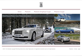
We were really excited about working on the Rolls Royce Motor Cars Press site. A prestigious looking site with some clever elements that make it quick and easy to use. Alas we didn’t get a car out of it all – maybe next time ; )
Article written by