Chapter 4: Typography in Web Design – Hyphenation, Emphasis.
September 6th, 2011
Hyphenation Hyphenation in typography serves to connect words that are divided when they cannot fit comfortably at the end of typed lines. To avoid fragmented words, hyphens should be placed predominantly between consonants. A useful tip is to ensure that a hyphen is sandwiched between two letters on one line and three on the following line. Emphasis Emphasis is a […]
Article written by

Chapter 3: Typography in Web Design – Kerning, Tracking, Baseline, Leading.
September 6th, 2011
Kerning/Mortising, Negative/Positive Spacing-Tracking Kerning-also known as mortising, adjusts character spacing in proportional fonts for an aesthetically pleasing result. This is achieved via moving the letters closer together, otherwise referred to as negative spacing. Tracking or positive spacing on the other hand, moves the letters further apart. When a font is kerned correctly, the area of the two-dimensional blank spaces between each pair […]
Article written by

Chapter 2: Typography in Web Design – Space, Widows & Orphans, Alignment, Paragraphs, Measure.
September 6th, 2011
Space Allow your text to speak by having enough negative or white space to envelope it. Another web typography rule is to keep 140% of line spacing in relation to your font size, as specified by the line-height CSS property. In fact the attention to micro space within the type, is the mark of a good designer. Not only is […]
Article written by

Chapter 1: Typography in Web Design – Contrast, Font Size & Hierarchy
September 6th, 2011
Typography derives from the Greek words ‘typos’ and ‘graphe’, meaning ‘form’ and ‘writing’. In web design it is the technique and art of arranging typefaces, which manifested when Tim Berners-Lee launched the first website in 1991. http://www.telegraph.co.uk/news/newstopics/ nationaltreasures/2194133/Sir-Tim-Berners-Lee-portrait.html Contrast The contrast between typography and background requires consideration of colour and font types. The purpose of text is to be perused […]
Article written by

Golden Ratio in Web Design
June 23rd, 2011
The Golden Ratio otherwise known as the divine proportion, is a calculation for perfection creating symmetry in maths and art etc. It is often represented by the Greek letter F (Phi), which is an abbreviation for the mean of Phidias (an Ancient Greek sculptor, painter and architect that applied this equation to his work, most notably the Parthenon). The mathematical […]
Article written by

Website Design Tips
June 3rd, 2011
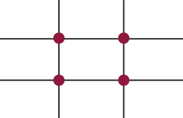
Optimise your images by creating web ready files, to increase the speed of downloading pages. Do not use flashing graphics, as statistics show that the majority of people are annoyed by them. Plan your grid thoroughly. Popular websites usually implement the standard 3 column layout, with the “golden ratio” proving most successful. Consider the relationship between your content and white […]
Article written by

Contrast Ratio Accessibility
April 20th, 2011
Contrast ratio in web design is the proportional scale in luminosity of the lightest to the darkest colour of the spectrum on your screen. The desired effect of contrast ratio is subject to the capacity of your display system. The combination of light emissions from environmental factors in a room and light reflection from the screen, all affect the outcome […]
Article written by

White Space
April 14th, 2011
White space is commonly regarded as negative space. Deriving from graphic design practice where white paper is often used during the printing process, it is the space on the page between markings and other formatting techniques such as text, margins, gutters, columns, figures and illustrations etc. It is important not to refer to white space as ‘blank’ as it creates […]
Article written by

Colour in Web Design
April 5th, 2011
As design is an inherent part of website aesthetics, the use of colour is momentous to its presentation. More than 80% of visual information is related to chroma. Web designers should consider the psychological effect that their chosen shades have on the target audience and if it supports the conveyed message of the represented organisation. Some colours evoke emotional responses, […]
Article written by