Chapter 2: Typography in Web Design – Space, Widows & Orphans, Alignment, Paragraphs, Measure.
Space
Allow your text to speak by having enough negative or white space to envelope it. Another web typography rule is to keep 140% of line spacing in relation to your font size, as specified by the line-height CSS property. In fact the attention to micro space within the type, is the mark of a good designer. Not only is the balance between the surrounding space of the text essential, the macro whitespace that encompasses the body of text is equally important.
Widows and Orphans
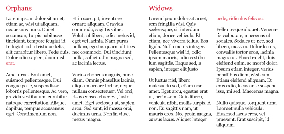
Avoid ‘widows’ and ‘orphans’ and I don’t mean social discrimination. In typesetting terms a ‘widow’ refers to the last line of a paragraph that falls at the beginning of the following column or page, separating it from the remaining text. Where as an ‘orphan’ is the opening line of a paragraph left by itself at the bottom of a page or column. ‘Orphans’ also include a word, partial word, or short line that appears on its own at a paragraph ending. They result in excessive white space between paragraphs or at the bottom of a page.
Alignment
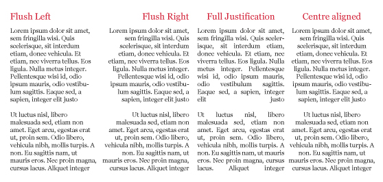
Alignment in typography has four basic formats. Multiple lines of text are aligned flush left, flush right, full justification or centre aligned. Although the edges of justified text may appear neater, this affects the spacing between words so the lines can be structured accordingly. Flush left or centred is more consistent for tracking purposes.
Paragraphs
Paragraphs allow readers to digest written information easier by providing text with composition. This group of topically related sentences are better scanned by readers if concise, by averaging six lines. Indents or line breaks are the most practised method of separating paragraphs. Sub headings also contribute to their visual consumption by adding description.
Measure
Measure denotes the horizontal width of a column. The readability of text is affected by line length as eyes become fatigued from repeated reading of extensive type. This is the reason that editorials are structured into columns. The ideal measure is 40-50 characters (including spaces) for a single column of type. On the other hand, a good measure for multiple columns of text is between 45-75 characters with an average of 66 characters.
(Continue to Chapter 3: Typography in Web Design – Kerning, Tracking, Baseline, Leading).


